Understanding and communicating how to visually represent your brand best is an important factor in developing strong brand identity guidelines. Depending on your audience, your visual identity is the first interaction your audience has with your brand, making it one of the more important sections of your marketing ecosystem. A visual brand identity guide is meant to set the standard and keep it!
The Key Elements Of A Visual Brand Identity Guide:

- Logo Guidelines:
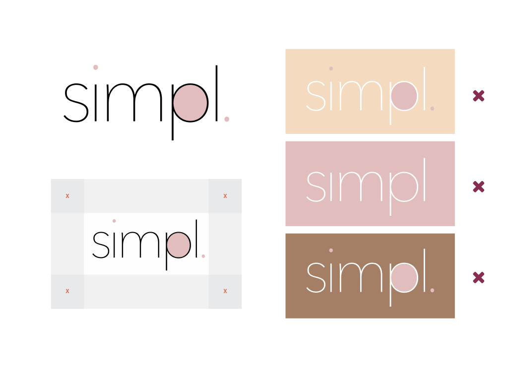
- Logo guidelines are used to create a recognizable brand usage signature. Think of these as your logo “Do’s and Don’ts”.
- Your logo guidelines should outline:
- Acceptable logo variations (Primary, Secondary, Long and Short)
- Acceptable color rules (Primary & Secondary)
- Spacing rules
- Minimum logo sizes

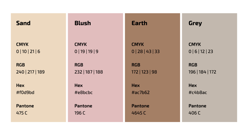
- Brand Color Palette:
- Make it easy for you and or your team to find your core brand colors by including color palettes with Hex codes, RGB values and Pantone colors. It is also helpful to include shade and tints if they are used in your marketing materials.

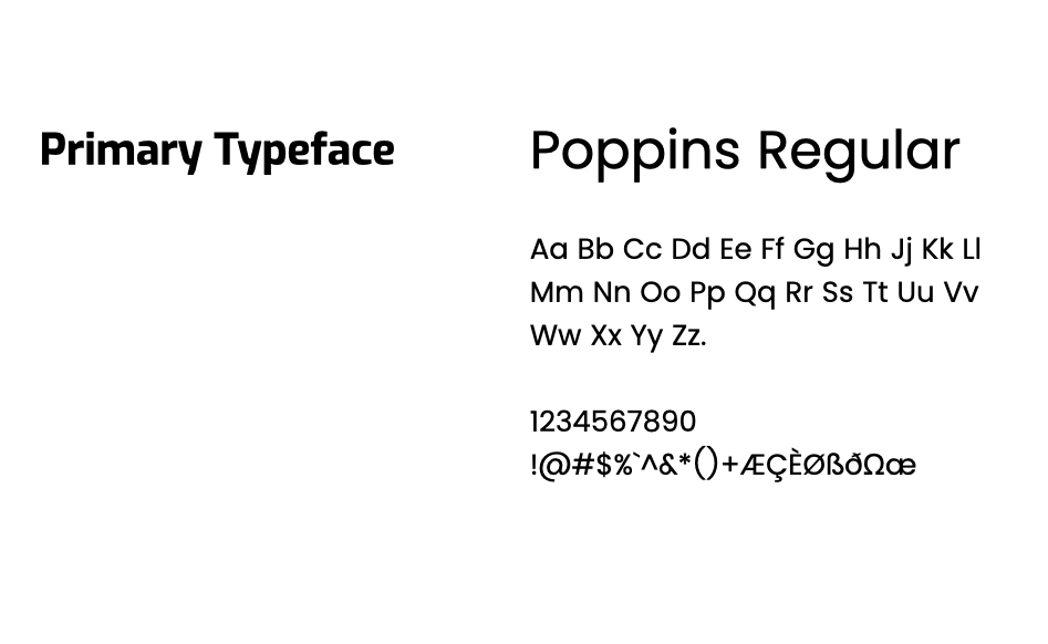
- Typography:
- This section is meant to outline your typography system.
- Specify the type hierarchy used by your brand, including what styles, size, and weights are used for what specific purposes (ie. Title, subtitle, paragraph, etc.)
Helpful Additional Elements:
- Brand Voice:
- Outline your brand’s voice to ensure you create messaging that resonates with your audience. Give some examples of appropriate writing tone, and contrast some “words you like” and “words you don’t like”.
- Imagery Guidelines:
- If your brand uses illustrations and/or photography, these guidelines give an understanding of style, concept, and composition to keep your imagery on-brand.
Want to learn how StreamLined can develop your Brand Identity? Sign up below!
"*" indicates required fields


